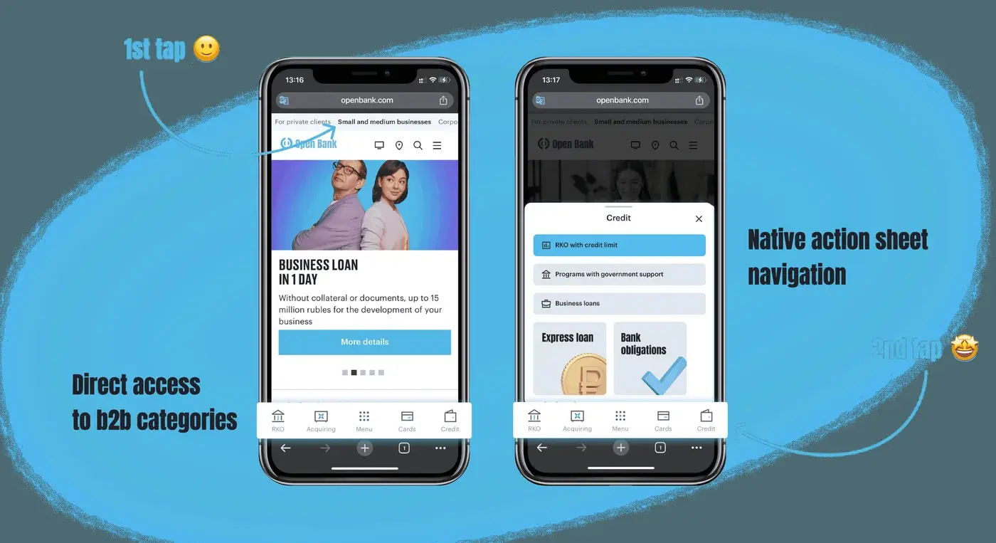
Playwise
Responsible-gaming UX for a mobile casino
Design lead and product designer. I led the concept end to end – the design audit of how player controls fail across live casinos, the six-screen mobile system, and the interaction rules behind it.
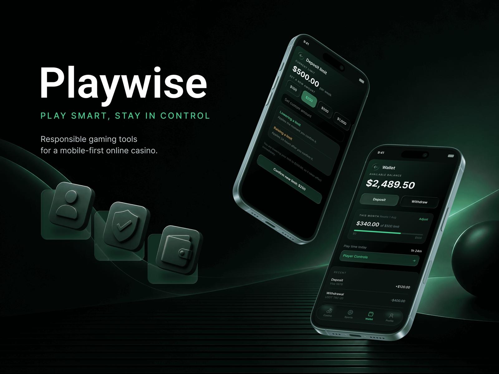
Breakdown
- Design audit
Mapped how deposit limits, reality checks, breaks and self-exclusion fail across live casinos, and why the friction usually runs the wrong way.
- A six-screen system
Wallet, player-controls hub, limit change, reality check, breaks and onboarding, designed as one calm dark-mode flow for mobile.
- Interaction rules
Safer actions instant and riskier ones delayed; a reminder that carries time, spend and net position instead of just the clock.
- Grounded in regulation
Each decision checked against real rules – UK RTS, Malta PPD, the German state treaty – and against published fines for tools that only passed on paper.
Overview
I designed Playwise, a concept for the responsible-gaming side of a mobile casino: the deposit limits, session reality checks, breaks and self-exclusion that every licensed operator has to ship. The starting point was an audit rather than a brief. Across live casinos these controls pass their compliance checks and then sit unused, because they live under Account settings, carry legal-sounding names, and put the same friction on the safer choice as on the riskier one. I redesigned the whole set as one calm, dark-mode mobile system: the limit lives in the wallet next to the money, the section is named for what it does, the session shows time, spend and net position honestly, and the reminder carries those numbers instead of just the clock. Every decision is checked against real regulation – UK RTS, Malta's Player Protection Directive, the German state treaty – so the design is defensible, not just tidy.
The challenge
Responsible-gaming tools are mandatory, already built and already audited, and almost nobody opens them. In the Gambling Commission's own survey, a year's use came out at 17% for financial limits, 10% for a reality check and 5% for a time out. The controls are not missing, they are unreachable: buried in settings, labelled in compliance language, and configured once at registration and never surfaced again. The sharpest problem is the direction of friction – on most products, lowering a limit and raising it are the same one-tap action, so nothing in the interface tells the safer move apart from the riskier one. The job was to keep every control a licence requires and make it something a player actually reaches and uses, without turning the product into a lecture.
What I did
I treated the controls as one system, not a settings page. I moved the deposit limit out of the account tree and into the wallet and the game surface, renamed "Responsible Gambling" to plain "Player Controls" so opening it does not mean admitting something about yourself, and gave the session an honest panel – time played, deposited, and net position as one signed number. I built the asymmetry regulators now require directly into the interface: lowering a limit applies immediately, raising it waits, and the screen says which is happening and why. Short breaks from one hour to a month sit one tap away and separate from irreversible self-exclusion, and the limit prompt appears at onboarding while nothing is riding on the answer. Six screens, dark and calm, with the continue button still primary, because the product informs the player rather than arguing with them.
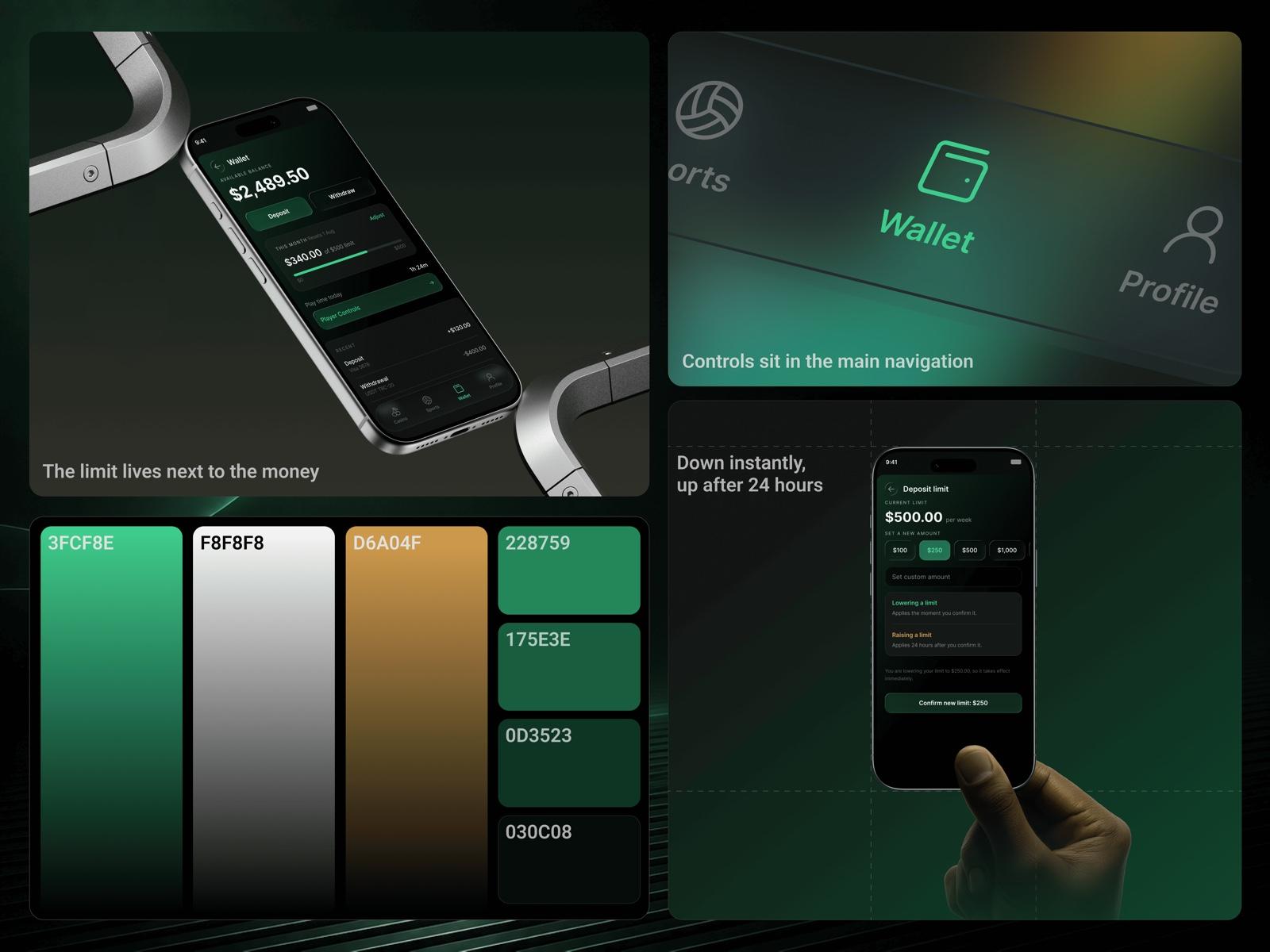
The deposit limit and player controls live in the wallet and the main navigation rather than buried in account settings, on the product's own green-and-gold palette.
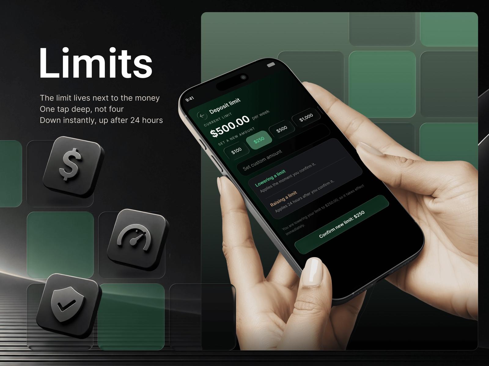
The deposit limit sits a single tap from the money, and lowering it applies the moment you confirm while raising it waits 24 hours.
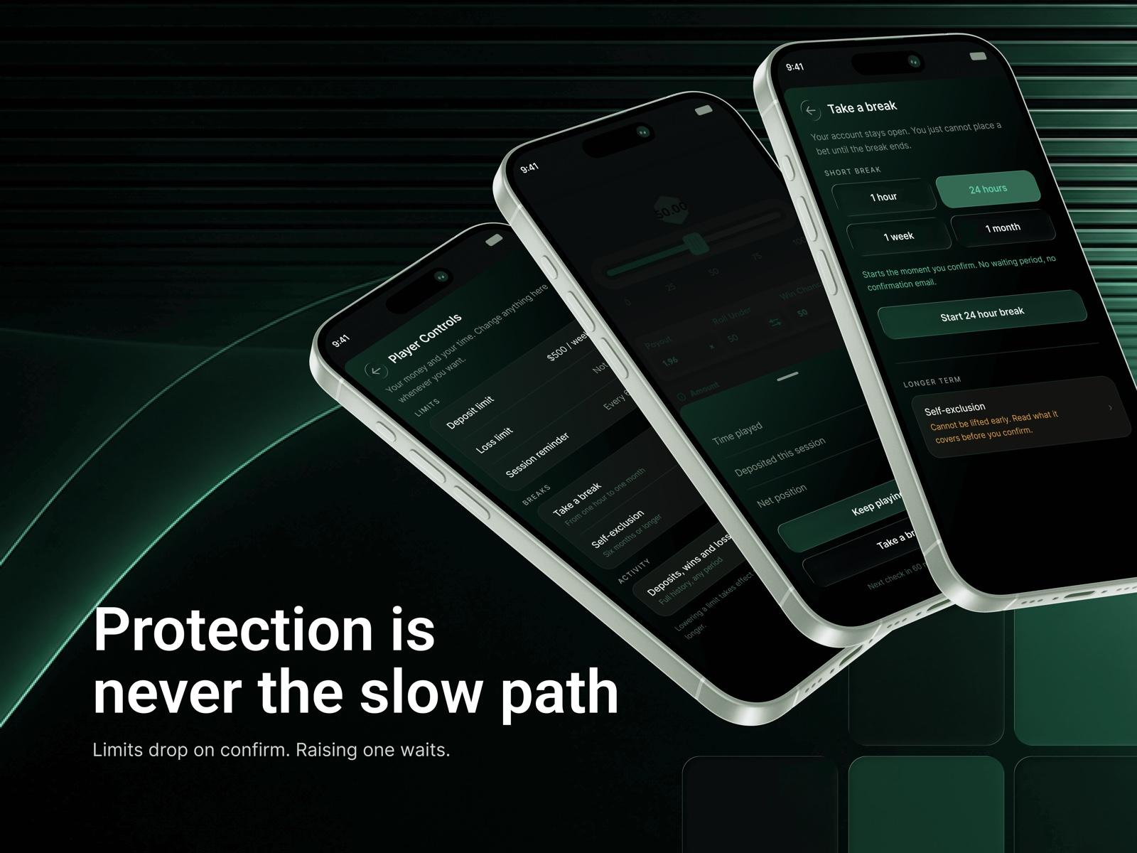
Player controls, an honest session reminder that shows net position, and short breaks from an hour to a month, all built so the protective choice stays the quick one.
iGaming · Responsible Gaming · Concept · 2026 · Mobile (iOS) · Product design, UX/UI, interaction design, dark-mode UI, motion