I went looking for how sweepstakes casinos are supposed to look. Nobody had written it down.
We designed a US sweepstakes casino, then found no standard for how the category should look. What I learned building the Sweeps style for Aduarius.
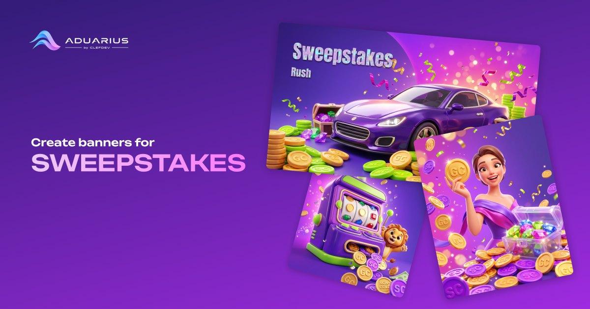
When we started putting together a sweepstakes style for Aduarius, the first thing I did was go looking for how this stuff is supposed to look. I had good reason to think I would find something. My studio, ClefDev, designed and branded Coinz.us, a US sweepstakes casino that launched in 2025 and is now reviewed on most of the big US sweeps sites. I led that team through all of it: brand, UI and UX, product design, user flows, style guide, right up to handing it over to development. So I had already built one of these from an empty page. I just assumed there was some category reference out there that I had never needed to look up before. A style guide, a convention, an article. I spent a while on it and did not really find anything.
Nobody wrote down what this category looks like
The mechanics are documented in detail. Every operator publishes its own rules, and regulators have been paying attention, so there is plenty to read. In 2025 the New York Attorney General's office sent directives to 26 sweepstakes operators, and California passed AB 831, which took effect on 1 January 2026.
The visual side is basically empty. The only industry report on creative I could find was from 2020, and it was about social casino, which is a different category with a different model. And the things people repeat as if everyone knows them, like Gold Coins always being gold and Sweeps Coins being silver or purple, I could not trace back to a single primary source. People say it, but nobody actually wrote it down.
So the category is big enough to attract regulators and legislation, and it still does not have a shared visual language. Every brand works it out on its own. That surprised me, and it ended up being the most interesting part of the project.
The two coins are the actual problem
In this vertical the picture carries product logic, which is not usually true in advertising.
There are two currencies and they do not mean the same thing. Gold Coins you buy, and you use them to play. They carry no prize value. Sweeps Coins are not sold at all. You get them for free, usually as a bonus attached to a Gold Coin purchase, or through daily promos, or by mailing in a request. Those are the ones that get redeemed for prizes, after the operator verifies who you are.
And there is no exchange between them at any brand I looked at. So if you make a banner where an arrow turns one coin into the other, you have drawn a product that does not exist.
I did not pick this up from marketing material. I learned it designing the screens where it actually matters, the coin store and the flows around it, where mixing up the two currencies is not a cosmetic mistake.
A general image generator has no idea about any of this. Ask it for "casino promo" and you get one big pile of money with nothing distinguished. For this vertical that image is already wrong before anyone reads the headline. Looking good and being correct are two separate requirements here, and the second one usually gets checked by someone who is not a designer.
One more thing I picked up while reading through operator rules: brands rename their currencies constantly, but GC and SC survive almost every rebrand. The full names change, the abbreviations stay. That was useful to know when we were deciding what to actually put on the coins.
Why we went light instead of dark
Most casino advertising is dark. Black and gold, dramatic lighting, that evening luxury thing. We went the other way with Sweeps on purpose. This was not the first time I had to decide how bright a sweepstakes product should look, because we worked through the same question when we built that brand and its style guide.
It leans purple and magenta, with bright lime green accents, a glow running from magenta into orange, and a lot of warm gold. Big rounded shapes, glossy candy surfaces, high-key studio light, soft shine, confetti.
The feeling I wanted was generous and celebratory, closer to a good mobile game than to a casino floor. That was a deliberate call and not just taste. A sweepstakes product presents itself much closer to casual gaming than to gambling, so the creative should look like the thing it is actually selling.
The style knows the subject, not just the colours
Aduarius has eight built-in styles. Sweeps is the only one where the style also carries a rule about what goes in the picture, not just how the picture looks.
The others answer "how should this look." Sweeps also has to answer "what has to be in frame, and how do those things relate to each other." I do not have a better name for it than a style with the subject matter built in.
What I can say about how it is put together:
It was built from references and from a library of samples we generated specifically for it, rather than from whatever happens to be lying around online.
The two-coin rule is baked in. When coins appear, it draws two clearly different denominations, a gold one engraved GC and a non-gold one engraved SC, and the engraving follows the colour instead of being assigned at random.
It is also specifically not allowed to draw any exchange or conversion between them.
We deliberately did not fix the colour of SC. Different brands do it differently, so the style leaves room for that instead of inventing a standard nobody agreed on.
One brief gives you square, vertical and horizontal, and each format gets recomposed rather than cropped. With small objects like coins that matters more than it sounds, because a bad crop can push the second coin out of frame and then the whole point of the image quietly disappears.
The honest part
What comes out is a draft, not an approval.
The two-coin rule is a drawing rule inside the style. It is not a guarantee for any individual render, and Aduarius does not check creative against anybody's requirements. That is not what the product does. Someone still has to look at every creative before it goes out.
Anyone who has worked with generative tools knows there is no such thing as a hundred percent, and I would rather say that than pretend otherwise.
What I got out of it
I started Aduarius because I spent years briefing and shipping ad creative and kept running into the same bottleneck. The sweepstakes style was a reminder that the generation part is the easy bit now. Most of the work went into understanding the category well enough to encode what it actually needs, and into being clear about what the tool can and cannot promise.
If you do creative for a sweepstakes brand, the style is in the product at aduarius.com. If your brand has its own currency names and its own coin graphics, that is the kind of thing my team builds as a custom style, as a service.
And a genuine question, because I still do not have a good answer to it. How does your team decide that one coin must not look like the other? I have not found two brands doing it the same way.
Sources
- Office of the New York State Attorney General – Attorney General James Stops Illegal Online Sweepstakes Casinos (June 2025)
- California Legislative Information – AB-831 Gambling: operation of a contest or sweepstakes (October 2025)
- Chumba Casino (VGW) – Chumba Casino Sweeps Rules, version 8.0 (December 2023)
- yellowHEAD – Ad Creative Benchmark Report: What Converts Social Casino Users? (November 2020)
- TheLines – Coinz.us Review and Ratings 2026 (February 2026)